Monday, December 12, 2011
craft project redo words
this project is about the journey of a dot. I wanted to convey the wandering feeling of this dot by using blur in my photography. This also helps show the unknown of where you are going or where you just were with this box. The dot although confined by the larger circles that create the paths would also be lost without them. The box is a huge maze that can take you in circles forever until you fine the escape into the large white space. When you and our dot character reach this point in the box the dot goes back into the maze for more, will you follow?


Monday, November 28, 2011
Navigation
With all of today's fancy navigation techneques I thought it would be fun to remember how it all started, with the stars. I found these images explaining the study of astonomy and providing the basics for navigation. Thinking about it like this makes it feel impossible to find your way anywhere, thank god for GPS.


 For those that don't know or have forgotten the image above is of a sextant. It was used by sailors to plot their position by using the sun and the horizon line.
 Coming full circle here is a nautical chart of Gloucester (the oldest seaport in America), Mass. This chart is more for ocean depths than it is used for navigation but could still be used that way.


image
I love snowboarding/skiing. Here are some nice inspirational images to get ready for snow/winter/fun. There are some nice black and white images, lighting, color action shots and tilt shift examples here. I love it.


Layer


texture observation


Below are examples of another type of texture. These tiles give the illusion of a textured wall and create depth.


Saturday, November 26, 2011
Hierarchy


the tone in communication across the three different pieces moves from very serious in the first piece to a more fun and playful message. Large scale type layered in the background with bold all caps red type running across the first peice. This is an important message that you should pay attention to. The pockets of white in between the letters that make up the background only add to the contrast of the red foreground colors. This message communicates that something seriously needs to change and fast.
the second piece is more subtle in the scale change as we were only allowed to use a difference of two point sizes. I chose to maximize the size difference by making my background type lowercase and the display text all caps. Layering the background type was a way to create a solid image that would leverage the hierarchy of the red type regardless of a small scale change. The white outline type adds a mood of frustration to the piece. There is still something wrong and now people are aware but frustrated at how long it's taken things to get done.
the final image shows the power of assembling and creating something larger than it's parts. By adding piece by piece to this image over time you end up with a firetruck. the call out "right of the people peaceably to assemble" can also be taken as a call to action, it is your right and duty to assemble and help play your part or be your piece to fixing the problems facing America.
the second and third pieces are the most successful. The second is able to show the frustration with the white outlined type. This also adds to the confusion of the piece as does the layered background. The third piece plays on the words 'to assemble' and 'peaceably' by literally showing the construction of a lego car. The word peaceably although spelled peace can imply the every protester is a vital piece and voice in the occupy movement.
I chose to use red and blue along with white because I was dealing with the constitution, a super American symbol, and the first ammendment which protects the basic rights of every American. I felt that I couldn't escape the red white and blue, go America connection so I embraced it. When I started this project I also wanted a font that was strong, serious and could potentially kick some ass if it had to, so I naturally chose Rockwell.


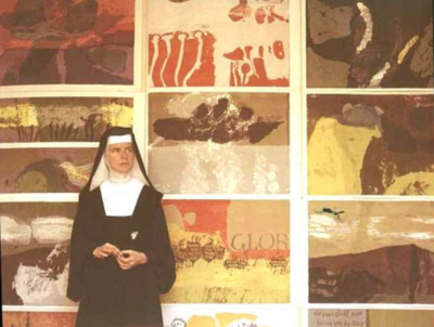
SISTER CORITA KENT
Sister Corita Kent is an artist, activist, and a nun, things that more often than not are on opposite sides of the spectrum. Sister Corita however was able to find a way to bring both sides of her life together and make an impact on the world.
One aspect of Sister Corita's life that I admire was her ability to resist submitting to the authority of the church and those in higher power positions. She was able to work within the system to spread her message of faith and self expression despite being a frequent target for criticism by conservative Catholics.
Her most popular medium serigraphy was the process of using a silk screen to make prints. This was a very interesting approach to art as it allowed her to make mass amounts of prints which she then sold cheep to bring art to those who could not otherwise afford it. I think this was a very smart idea, not only was her work being distributed widely but it made the purchase of one of her pieces no financial burden at all. I know her point wasn't be become famous as the time but this was a very creative way to get her work out into the world and with a unique target market of religious people.

I really like the piece above, the image/type relationship I feel is very strong and I enjoy the contrast between the "let the sun shine in" message and the image looking like a crusty old dark picture of the pope that maybe hasn't seen sunlight in hundreds of years. I can also hear Sister Corita talking to the church telling them to let new light into this old system of the church. I don't know if this was the point but it's very powerful and I like to think of it that way.


"Mary Mother is the juciest tomato of them all."

I've lived in Boston for my whole life and have driven past this water tower hundreds of times never knowing who had painted it or why. Knowing now that it was one of Sister Corita's works adds a whole new dimension to the tower and I'm seeing it in a brand new way. It's very cool when something so ordinary and that you've seen so many times suddenly becomes a work of art. Hmm... kind of like a lot of Sister Corita's work with advertising slogans and signage.

Wednesday, November 9, 2011
outside reading
Fun solar energy quiz
I found this little test about how much you actually know about solar energy on National Geographic. I started of strong and got the first 4 questions right but then lost it. I ended up with 33%.
I found this little test about how much you actually know about solar energy on National Geographic. I started of strong and got the first 4 questions right but then lost it. I ended up with 33%.
Saturday, November 5, 2011
Texture


My description of the original texture was;
tough, dourable, built for traction and
to grip the road. dirty rough and grooved.
to grip the road. dirty rough and grooved.
the grooves run all along the tire, creating vallys of
about half an inch that run verticle as well as zig zaging around.
about half an inch that run verticle as well as zig zaging around.
In total I used 40 layers.
The choice of typeface used which was Optima, effected the recreation of the image by really forcing me to use layers and transparencies to get the right effect of depth and still maintain a feeling of grittiness that was in the original image. I ended up using mostly all small caps in the recreation for the strong sharp edges that that specific style provided. The zig zag shape running along the center of the image was one of the most important pieces in the recreation of this image. It gives a strong sense of depth in the image. The treads themselves were also a very key piece in the recreation. Specifically getting the right balance of colors, there are some whites, grays and blacks that are all working together to give the tire it's gritty dirty texture. I achieved this by using a combination of transparencies and layering type on top of type until the desired affect was achieved.
What can a photograph convey that type cannot? I think a photograph can convey a lot of detail much easier that type can. Being able to capture small pieces of an image that let the viewer figure out what they are looking at even if it is a close up or crop of an image.
I think type can convey more of the mood and feeling than an image can. When an image is recreated with type the choice of words used, the font and the colors all come together to aid in the mood and experience of the recreated image.
Subscribe to:
Posts (Atom)