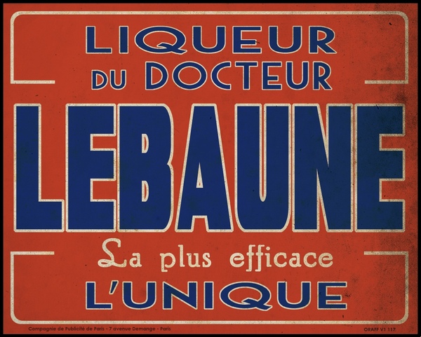
These old posters are a good examples of primary color usage. (The first poster is screaming Red Sox.) I think my favorite of the group is the yellow and blue, the yellow color draws my eye and the blue ribbon/boarder creates a nice contrast and makes the type nicely legible. I also really like the fact that the signs are in french.
found at


No comments:
Post a Comment